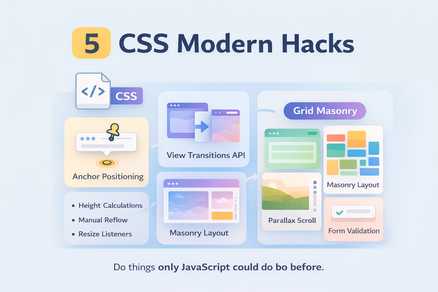
Back in the day, I remember that every cool thing on the web required you to have some fancy JS library or good knowledge of how to build it around it. You started with jQuery as your main source of truth and then expanded into another small library that paired perfectly with it, just to build a fancy counter or an animated button.
But…the times have changed, and now I’ve seen a lot of fancy things built around pure CSS, and I’m not just talking about experimental stuff; I’m talking about things that are already very well integrated in all modern browsers, and we are just ignoring them. I’ll give you a couple, or better yet, I’ll name 5 of them here:
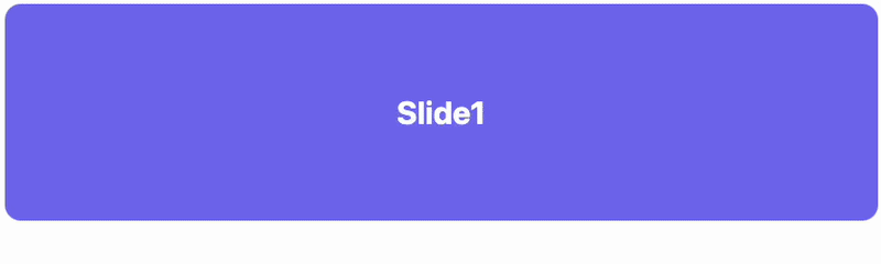
A pure CSS Slideshow
To build a simple slideshow required some JS with timers, bugs when you lose focus on the elements
.slideshow {
  position: relative;
  height: 220px;
  overflow: hidden;
  border-radius: 16px;
}

.slide {
  position: absolute;
  inset: 0;
  display: grid;
  place-items: center;
  font: 700 32px system-ui;
  color: white;
  opacity: 0;
  animation: slideShow 12s infinite;
}

/* delay between slides */
.slide:nth-child(1) { animation-delay: 0s; }
.slide:nth-child(2) { animation-delay: 4s; }
.slide:nth-child(3) { animation-delay: 8s; }

.slide:nth-child(1) { background: #6366f1; }
.slide:nth-child(2) { background: #22c55e; }
.slide:nth-child(3) { background: #ec4899; }

@keyframes slideShow {
  0%   { opacity: 0; }
  10%  { opacity: 1; }
  30%  { opacity: 1; }
  40%  { opacity: 0; }
  100% { opacity: 0; }
}
<div class="slideshow">
  <div class="slide">Slide 1</div>
  <div class="slide">Slide 2</div>
  <div class="slide">Slide 3</div>
</div>
Liquid Glass Effect
This trend is making a comeback thanks to the latest iOS update (as of the date of this article’s publication), and it doesn’t require adding a PNG silver background image to each element. Here is how it works.
/* background scene */
.scene {
  min-height: 300px;
  display: grid;
  place-items: center;

  background:
    radial-gradient(circle at top left,
      rgba(255,255,255,.35),
      rgba(255,255,255,0) 60%),
    radial-gradient(circle at bottom right,
      rgba(255,255,255,.18),
      rgba(255,255,255,0) 60%),
    linear-gradient(
      135deg,
      #0b0f16,
      #111827,
      #020617
    );
}

/* glass card */
.glass {
  position: relative;
  padding: 26px 30px;
  border-radius: 22px;

  background:
    linear-gradient(
      180deg,
      rgba(255,255,255,.28),
      rgba(255,255,255,.12)
    );

  border: 1px solid rgba(255,255,255,.35);

  backdrop-filter: blur(18px) saturate(110%);
  -webkit-backdrop-filter: blur(18px) saturate(110%);

  box-shadow:
    inset 0 1px 0 rgba(255,255,255,.6),
    inset 0 -1px 0 rgba(255,255,255,.12),
    0 20px 40px rgba(0,0,0,.45);

  color: #f8fafc;
}

.glass::before {
  content: "";
  position: absolute;
  inset: 1px;
  border-radius: inherit;

  background:
    linear-gradient(
      120deg,
      rgba(255,255,255,.55),
      rgba(255,255,255,0) 40%
    );

  pointer-events: none;
}
<div class="scene">
  <div class="glass">
    <h3>Liquid Glass</h3>
  </div>
</div>
End Result:
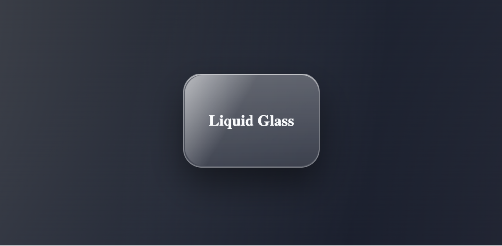
This effect might seem complex, but it’s just a few well-combined layers:
The background .scene creates a light-dark area behind the card. Then we add contrast. The trick here is the backdrop-filter: the blur softens whatever is behind the card, and the saturate boosts the color so the glass doesn’t look dead.
Animated Numbers
Ok, this works but only in some specific cases, like landing pages using static values or metrics that are not supposed to change during a long period of time, for dynamic number animations, I still recommend using the good old JavaScript.
<div class="stat" style="--to: 1280">0</div>
@property --num {
  syntax: "<integer>";
  inherits: false;
  initial-value: 0;
}

.stat {
  --to: 100;
  font: 700 48px/1 system-ui;
  animation: count 1.4s ease-out forwards;
  counter-reset: num var(--num);
}

.stat::after {
  content: counter(num);
}

@keyframes count {
  from { --num: 0; }
  to   { --num: var(--to); }
}
Result:
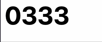
In this snippet, –num plays a critical role:
@keyframes count {
  from { --num: 0; }
  to   { --num: var(--to); }
}
Normally, CSS custom properties are strings, and your browser won’t know how to animate them, which also adds a limitation because the final value is known ahead of time, meaning it can’t be used from fetched data. Still is very useful if you want to showcase something like the percentage of projects delivered, or years of service; that’s the type of data that usually doesn’t change daily.
RGB Buttons
Oh yes! RGB is possible using css

Here’s the code
<button class="gradient-btn">
  Click me
</button>
.gradient-btn {
  position: relative;
  padding: 14px 28px;
  font-size: 16px;
  font-weight: 600;
  color: white;
  background: #0f172a;
  border: none;
  border-radius: 16px;
  cursor: pointer;
  z-index: 0;
  overflow: hidden;
}

/* animated gradient border */
.gradient-btn::before {
  content: "";
  position: absolute;
  inset: -2px;
  border-radius: inherit;

  background: linear-gradient(
    120deg,
    #6366f1,
    #22c55e,
    #ec4899,
    #6366f1
  );

  background-size: 300% 300%;
  animation: borderFlow 6s linear infinite;

  z-index: -1;
}

/* mask to create border effect */
.gradient-btn::after {
  content: "";
  position: absolute;
  inset: 2px;
  border-radius: inherit;
  background: #0f172a;
  z-index: -1;
}

@keyframes borderFlow {
  0%   { background-position: 0% 50%; }
  100% { background-position: 300% 50%; }
}The key idea here is that we’re not animating the border property itself. We’re animating a full gradient layer underneath and strategically hiding the middle. No SVG, no extra markup, no JavaScript, just pure CSS, no more GIF background images to achieve some kind of animated visual in your site ( as referenced the GIF above haha )
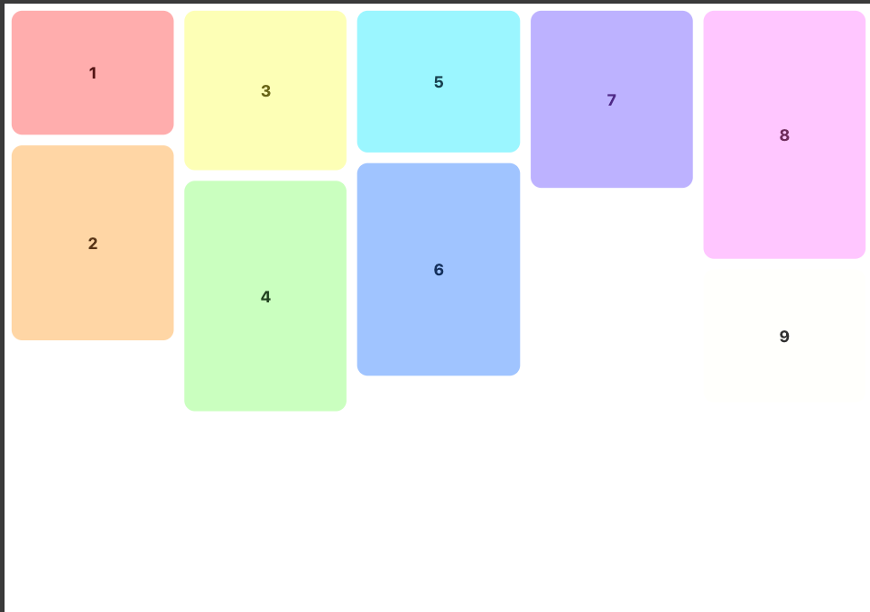
Mansory Layout
For years, this type of layout required JavaScript because CSS couldn’t naturally “pack” uneven elements into vertical columns without leaving gaps. That’s where libraries like Mansory.js entered to solve this problem, it worked, but it meant another library, reflows, and more weight to your website just to move those elements.
Today, CSS can handle this natively. With a simple columns-based fallback (using column-width and break-inside: avoid)
<div class="masonry">
  <article class="item" style="--h: 140px">1</article>
  <article class="item" style="--h: 220px">2</article>
  <article class="item" style="--h: 180px">3</article>
  <article class="item" style="--h: 260px">4</article>
  <article class="item" style="--h: 160px">5</article>
  <article class="item" style="--h: 240px">6</article>
  <article class="item" style="--h: 200px">7</article>
  <article class="item" style="--h: 280px">8</article>
  <article class="item" style="--h: 150px">9</article>
</div>/* fallback: works everywhere */
.masonry{
column-width: 180px;
column-gap: 12px;
}
.item{
break-inside: avoid;
margin: 0 0 12px;
height: var(--h, 180px);
border-radius: 12px;
background: #e5e7eb;
display: grid;
place-items: center;
font: 700 18px system-ui;
}
@supports (grid-template-rows: masonry){
.masonry{
display: grid;
grid-template-columns: repeat(auto-fill, minmax(180px, 1fr));
gap: 12px;
grid-template-rows: masonry;
column-width: auto;
column-gap: normal;
}
.item{ margin: 0; }
}With @supports (grid-template-rows: masonry) we are explicly asking the browser “Are you modern enought to handle this” If the answer is yes we use grid-template-rows: masonry
Final Result:
And I think that’s all folks, I hope you enjoyed this article, there are a lot more features and cool things that we can do with CSS nowdays and it’s surprising how fast the web is moving around this.
Leave a Reply
You must be logged in to post a comment.